Publisher of perspective and personality for agencies and organizations willing to do the same.
--
Scott is an international award-winning Design Director / Art Director originally from New Zealand, now based in Canada.
With over 13 years’ experience working in design, his work covers conceptual editorial design, brand design, advertising art direction, and everything that falls within.
That may be a lot of things, but whether it’s for waste management giants, a postpartum support house, a city of 1.5 million, or stuffed-crust pizza, he brings the same relentless hunt for the big idea and an emotional intelligence that leaves even the most complex subjects simple and full of feeling.
Ranked in top 30 • Strategy Magazine Report Card’s top designers in Canada
Winner • Design • Entire Publication • Applied Arts Design
Bronze • Design • Strategy Marketing Awards
Winner • Design • Exhibition Catalogues • Communication Arts Design
Silver • Design • Corporate Comms • ADCC Awards*
Bronze • Design • Public Service • ADCC Awards
Winner • Mobile Series • Communication Arts Advertising
Gold • Design • Strategy Marketing Awards*
Winner • Integrated Brand Identity • Communication Arts Design
Bronze • Rebrand • Design • Strategy Marketing Awards
Merit • Typography • Design • Strategy Marketing Awards*
Winner • PSA/Charity/Government • Applied Arts Design Awards
Gold Anvil • Direct Mail • AdRodeo Awards
Silver Anvil • Brand Identity • AdRodeo Awards
Gold Anvil • Annual Report • AdRodeo Awards*
Silver Anvil • Annual Report • AdRodeo Awards*
Gold Anvil • Microsite/Campaign Website • AdRodeo Awards*
Gold Anvil • Purpose Driven Impact • AdRodeo Awards*
Gold Anvil • Fearless Client • AdRodeo Awards*
Gold Anvil • Craft Design • AdRodeo Awards*
Gold Anvil • Craft Art Direction • AdRodeo Awards*
Merit • Design • The One Show
Bronze • Design • Strategy Marketing Awards
Silver • Design • Public Service • ADCC Awards
Winner • Best in Show • Communication Arts Typography
Silver • Photography • Graphic Design Photography • ADCC Awards
Winner • Brochure • Communication Arts Typography
Winner • Brochure/Report • Communication Arts Typography
Winner • Annual Report • Communication Arts Design
Finalist • Public Service • Communication Arts Design
Winner • Public Service/Charity • Applied Arts Design
Winner • Entire Publication Design • Applied Arts Design
Best in Show • AdRodeo Anvils
Winner • Annual Report • AdRodeo Anvils
Silver • Photography Single • AdRodeo Anvils
Silver • Photography Series • AdRodeo Anvils
Silver • Craft Photography • AdRodeo Anvils
Shortlisted • Design • The One Show
Winner • Annual Report • Communication Arts Design
Winner • Annual Report Single • Applied Arts
Merit • Strategy 101st Marketing Awards • Design
Finalist • NZ Best Awards
Merit • Design • The One Show
Winner • Entire Publication Design • Applied Arts
Merit • Design • Marketing Awards
Winner • Cause Related Creative Response • Applied Arts
Winner • Brochure • Communication Arts Design Awards
Anvil • Brochure, Book, and Publication Design • Ad Rodeo Awards
Finalist (Pending) • Design Communication • NZ Best Awards
Bronze • Live Action / Animation • IDÉA Awards (Quebec)
*As Leadership
Wilder Institute / Calgary Zoo was undergoing a complete overhaul of its Asia zone, rebuilding almost all of the habitats, interpretive installations, and the landscaping of the entire side of the park.
As a part of this, they sought to rethink the naming and visual langauge of the zone for the next few decades to come.
With changing attitudes & understandings of cultural appropriation and pastiche, a key directive was to develop a look and feel that avoided cultural representations and understandings of Asia — once commonplace in these sorts of public institutions — instead focussing on the ecological and geographical characteristics. This is, of course, a Zoo.
As established by the brand strategy, the single word this brand needed to embody was ‘Vastness’, capturing the breadth of different ecosystems, climates, and geographies across the largest continent, from the Southeast Asian tropics to the high alpine of the Eastern Himalayas.
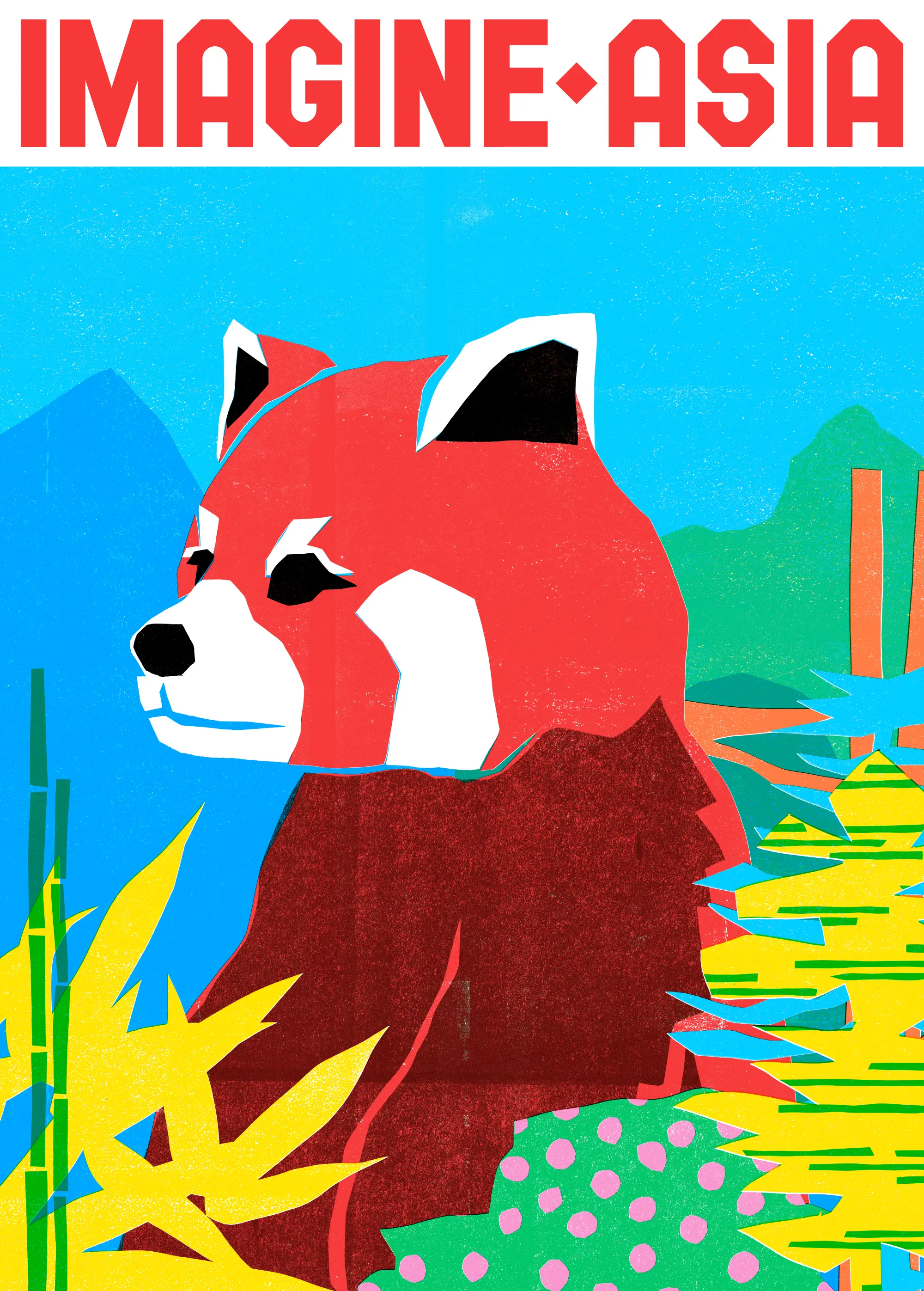
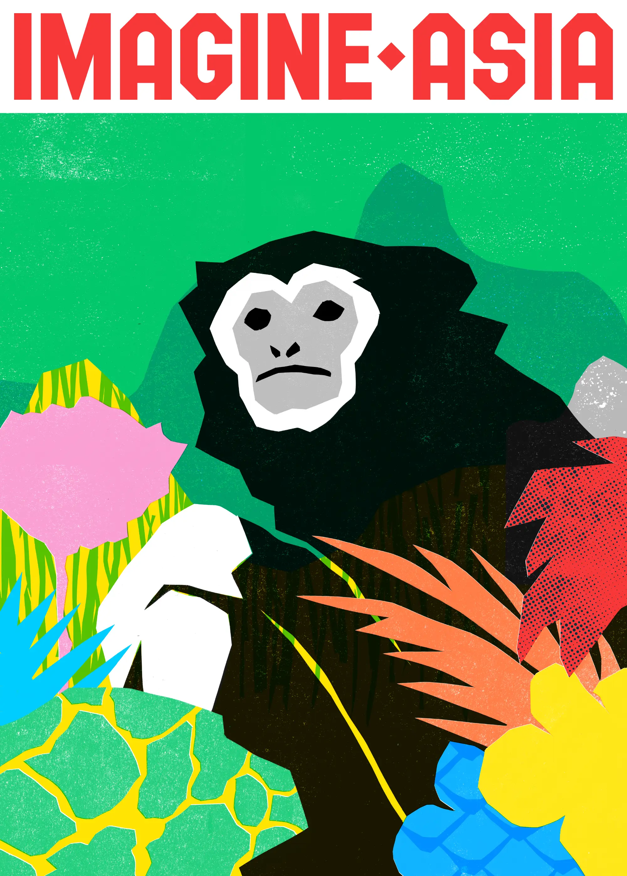
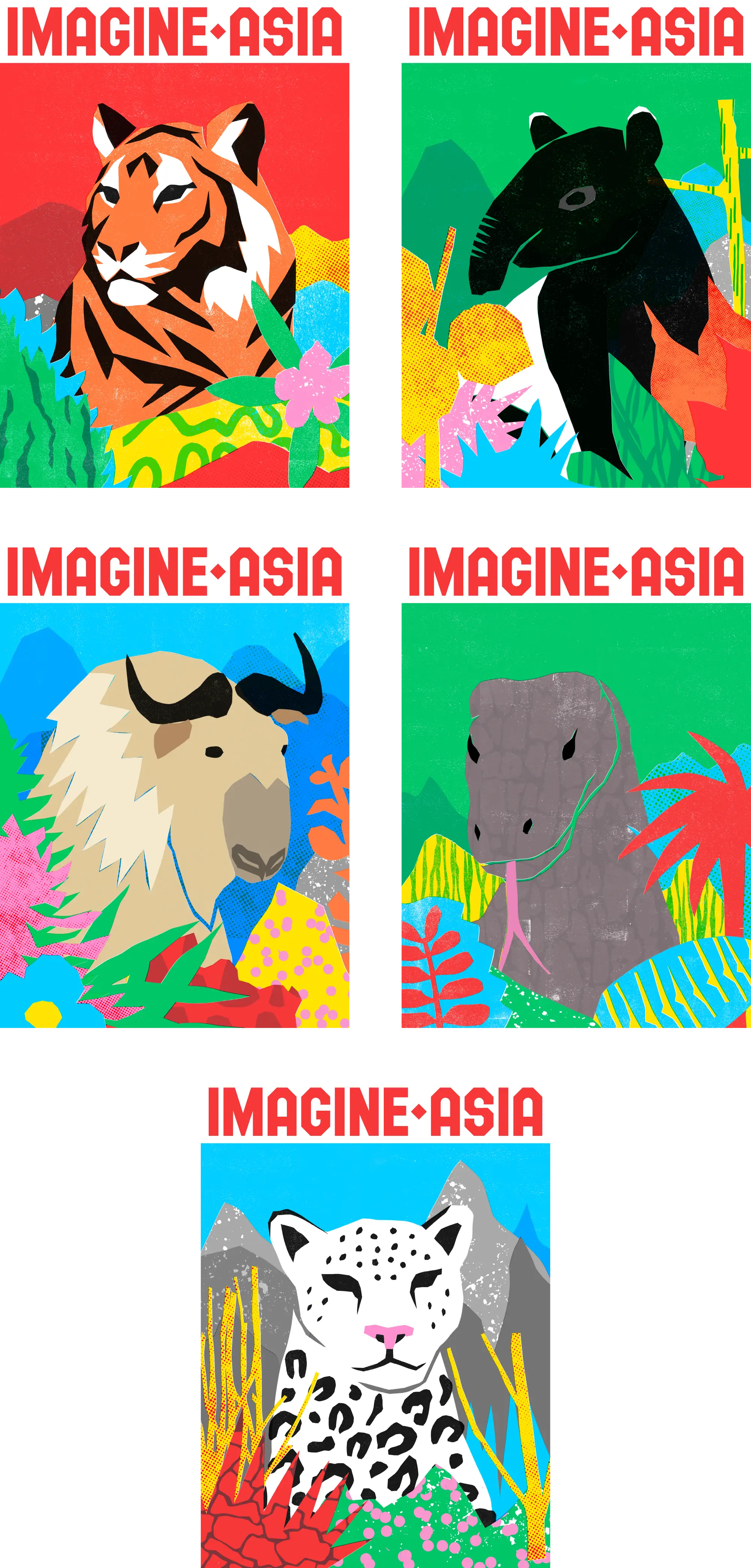
We developed a name suggesting a place limited only by one’s own imagination; as endless as the landscapes themselves, setting this with custom woodcut-inspired letterforms.
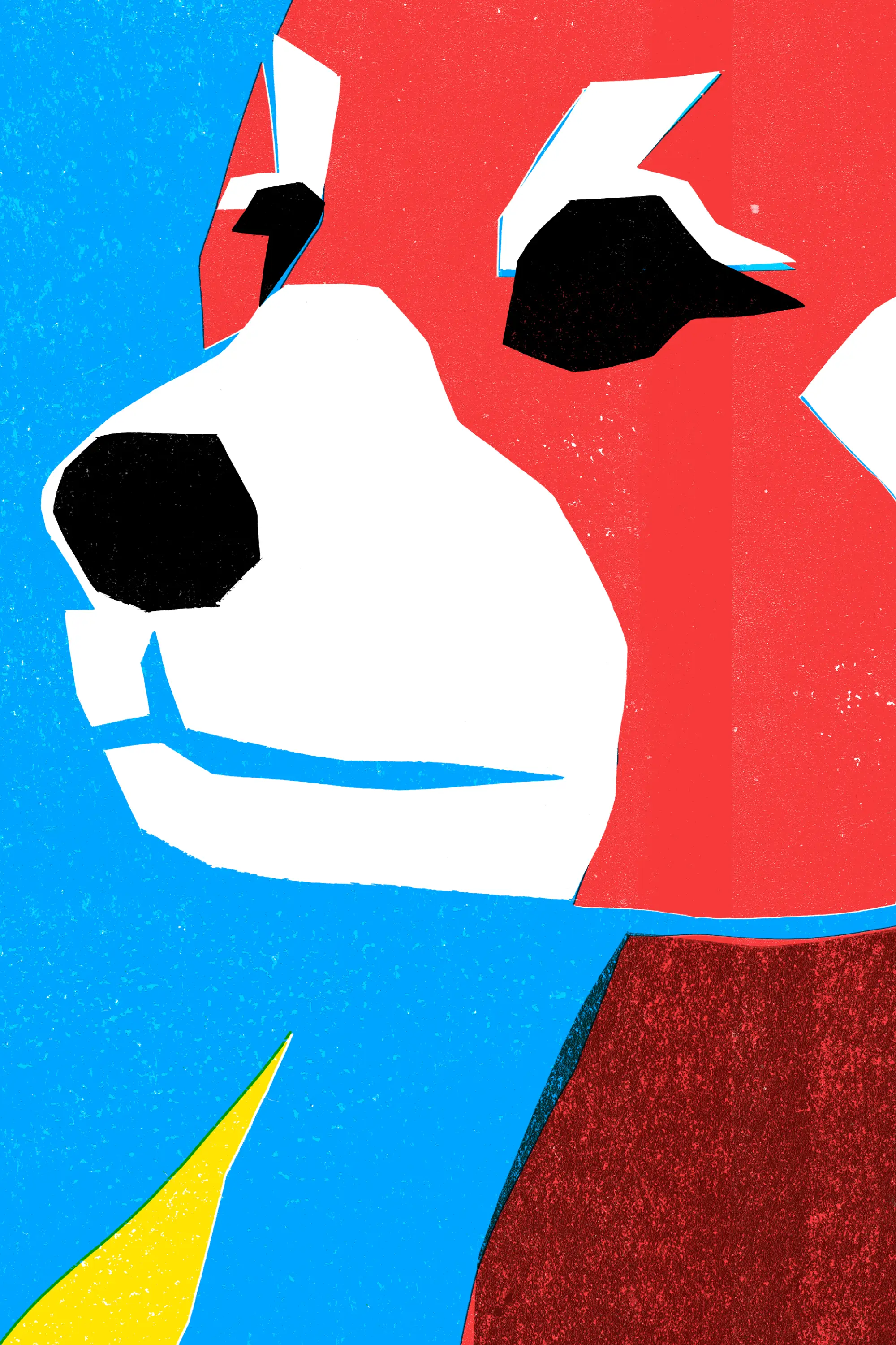
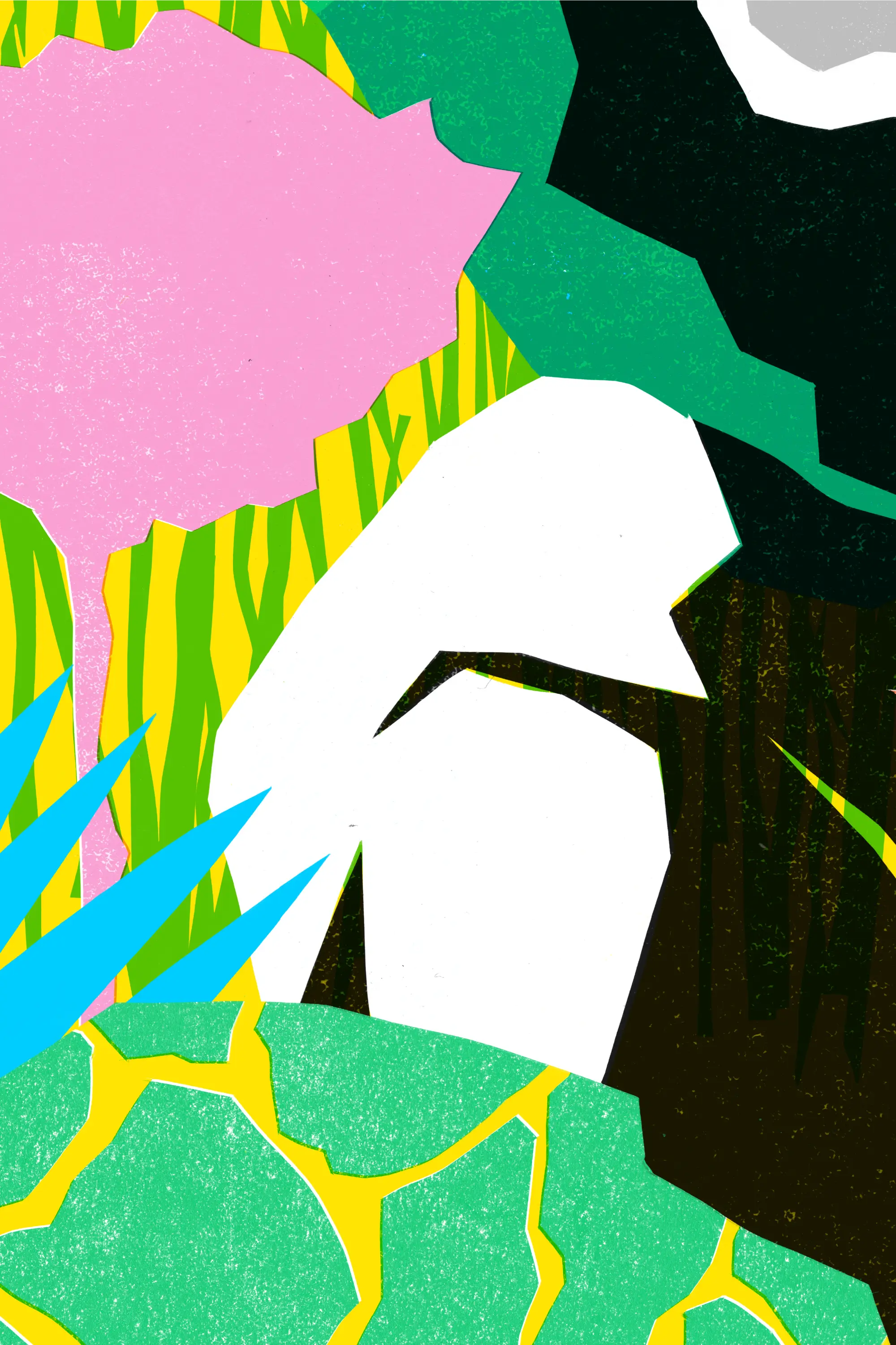
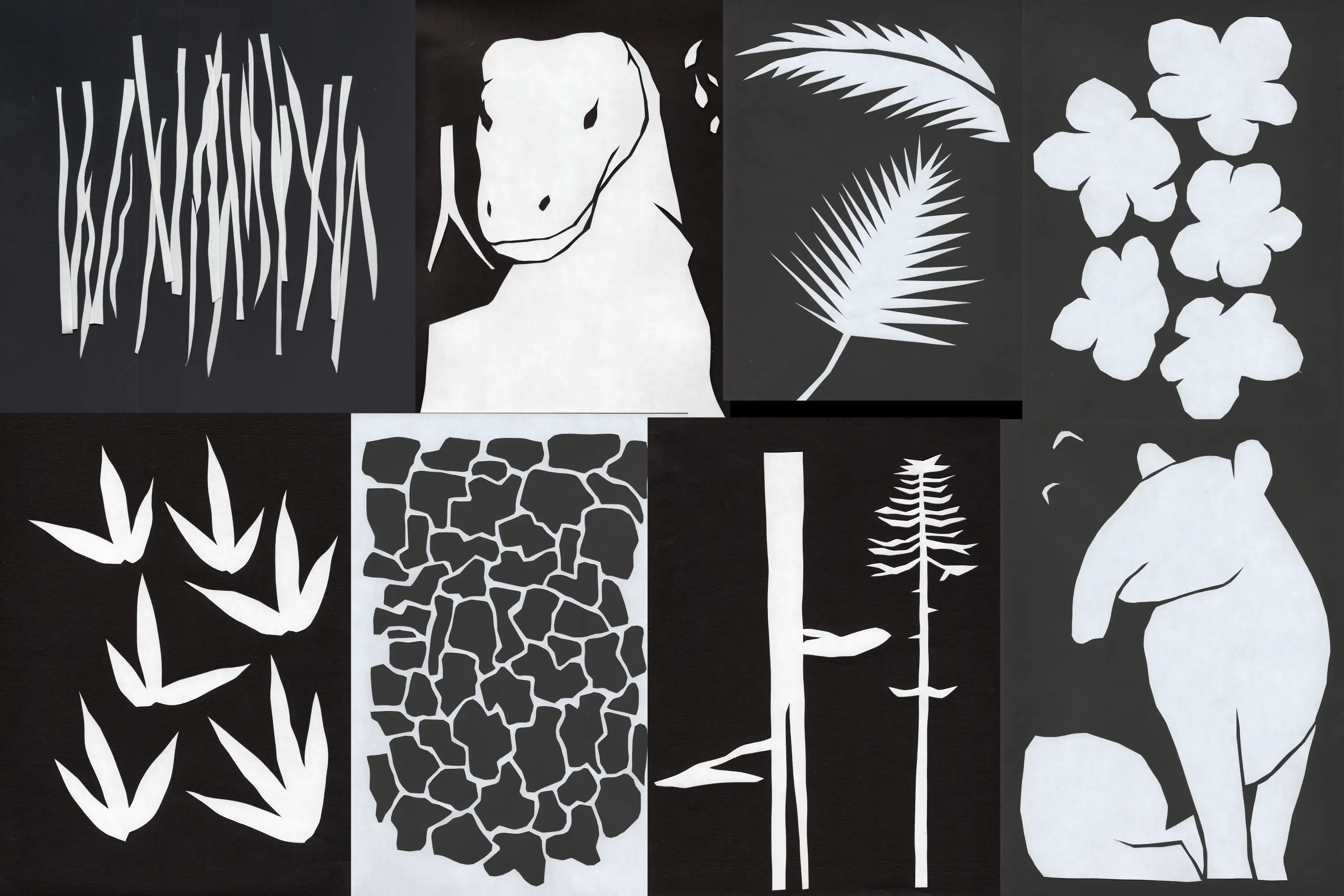
To bring this name to life, we sought an illustration style depicting Vastness by way of chaos — everything, everywhere, all at once. We see layers upon layers of abstracted shapes of flora found in the animals’ natural habitats; trees, shrubs, bushes, flowers, fruits, leaves. Within those we find arrays of textures; bark, petals, stone, rock faces, root systems, rivers. These cues and nods show the importance of the immediate environments the animals live in, rather than focusing entirely on the animals themselves.
Each of these shapes and textures were handcut from paper and scanned in before colourizing, creating a wonderfully organic, loose, simple and playful Matisse-like feeling, leaving ample room for visitors’ imaginations to fill in the gaps as they move through the park, learning about each habitat.